22 Jun
If you want to make a website faster and you only have time to fix one thing, fix the images. It is not a glamorous answer, but it is the correct one. Images make up close to half of the average page’s total weight, and on the large majority of pages the single largest element a visitor waits for – the one that defines the Largest Contentful Paint metric – is an image. That means image strategy is not a side detail of performance work. It is the center of it. Two levers do most of the heavy lifting: choosing a modern format, and loading each image at the right moment. Used together, and used correctly, they can cut page weight dramatically and move Core Web Vitals from failing to passing.
Why the format you choose matters so much
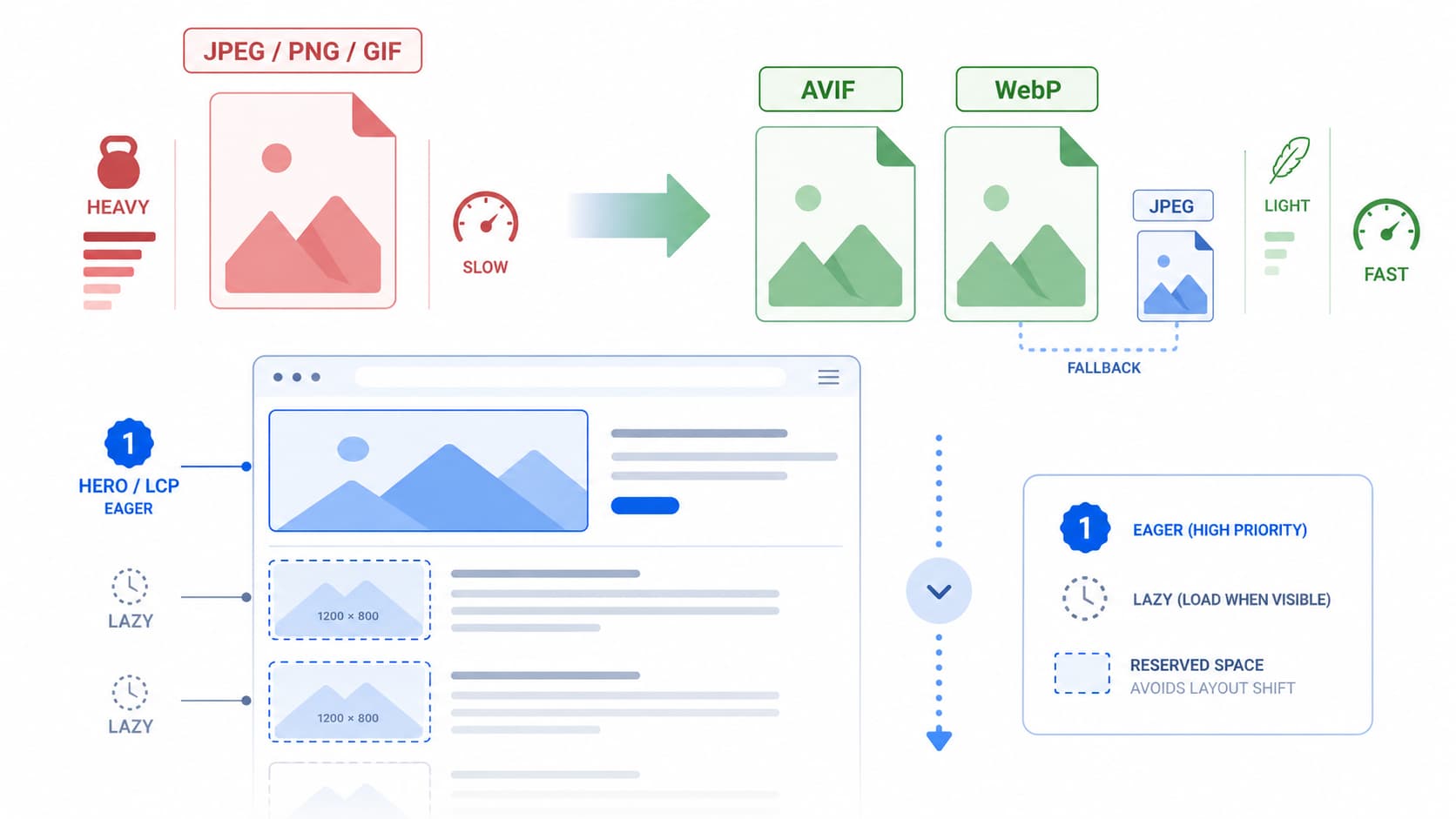
For years the web ran on JPEG, PNG, and GIF, and they still work, but they are inefficient by modern standards. The newer formats were built specifically to deliver the same visual quality in far fewer bytes, and the savings are substantial enough to change how a page performs.
WebP is the safe, universal choice today. It produces files roughly a quarter to a third smaller than an equivalent-quality JPEG, supports both lossy and lossless compression as well as transparency, and is supported by every modern browser. For most images it is a sensible default with essentially no downside.
AVIF goes further. It compresses far more aggressively, commonly around half the size of a comparable JPEG and meaningfully smaller than WebP, while preserving quality remarkably well at low bitrates. It also handles transparency and high dynamic range. Its browser support has become very strong, covering the vast majority of users, but it is not quite as universal as WebP, which is the one reason you never serve it alone.
The practical takeaway is a hierarchy rather than a single winner: serve AVIF first for the deepest savings, fall back to WebP for browsers that lack AVIF, and keep JPEG as the final safety net for anything older. On an image-heavy page, simply moving from JPEG to a modern format can shrink total page weight by well over ten percent before you do anything else.
Serving all three formats without breaking anything
The elegant part is that you do not have to choose one format and gamble on your audience’s browsers. The HTML picture element lets you offer several and let each browser pick the best one it understands. You wrap source elements pointing at the AVIF and WebP versions, with a plain img tag referencing the JPEG as the fallback. The browser walks the list, takes the first format it supports, and ignores the rest. Newer browsers get AVIF, older ones degrade gracefully to WebP or JPEG, and you write the markup once.
There is a server-side alternative that many teams prefer for cleaner markup: let a content delivery network negotiate the format. The browser announces what it accepts through a request header, and the CDN returns the smallest format that fits, all from a single URL. This is convenient, but it carries one classic trap. You must configure the cache to vary on that accept header. Without it, the network can cache an AVIF file and then serve it to a browser that cannot read it, breaking the image entirely. The fix is a correct vary-on-accept setup, and any serious CDN supports it.
Compression settings that look identical but weigh less
Choosing the format is only half the job. The quality setting determines how much you actually save. Modern formats let you push compression surprisingly hard before the eye notices anything. For WebP, a quality level in the mid-seventies to mid-eighties typically looks indistinguishable from the original. For AVIF, you can go even lower, often around the low-to-mid sixties, and still match the perceived quality of a high-quality JPEG. The only reliable way to find the right number is to compare versions visually, since the ideal setting varies with the image. Tools that show before-and-after previews make this quick, and automated build pipelines can apply your chosen settings to every new upload so the discipline does not depend on anyone remembering.
Lazy-loading: load what the user can see, defer the rest
The second lever is about timing. A typical page asks the browser to download every image the moment it loads, including the ones far down the page that the visitor may never scroll to. Lazy-loading flips this. It defers off-screen images until the user is about to reach them, so the browser spends its early, precious bandwidth only on what is actually visible.
The reason this helps performance is straightforward: fewer images competing for the connection in the first moments means the important content, including your main hero image, arrives sooner. The bandwidth savings on long pages can exceed eighty percent for visitors who never scroll to the bottom.
The best news is how little effort this now takes. The native HTML attribute loading=”lazy” handles it with no JavaScript at all, and it is supported across modern browsers. For the rare case of supporting very old browsers, a small script using an intersection observer can fill the gap, but for most sites the native attribute alone is enough. Background images set in CSS are the one exception, since they cannot use the attribute; there you toggle a class with an intersection observer instead.
The one mistake that quietly ruins everything
Here is the single most important rule, and the one most often broken: never lazy-load your LCP image. The hero image at the top of the page, the very thing whose load time the Largest Contentful Paint metric measures, must load eagerly and as early as possible. If a template applies loading=”lazy” to every image globally, it has almost certainly lazy-loaded the hero, which delays the exact metric you were trying to improve. Real-world measurements show that lazy-loading the LCP image can push its load time dramatically later and collapse the share of pages rated “good.”
The correct pattern is simple to state: eager above the fold, lazy below it. Leave the hero at the default eager loading, and for an extra boost, add fetchpriority=”high” to it so the browser knows to prioritize it over everything else discovered at the same time. Google’s own tests have shown this one attribute shaving hundreds of milliseconds off LCP. But use it on exactly one image per page, because if everything is marked high priority, nothing is, and the effect dissolves.
Two finishing touches that prevent layout shift
While optimizing images, fix the other Core Web Vital they affect. Always set explicit width and height attributes, or an aspect ratio, on every image. Without them the browser cannot reserve space before the image arrives, so content jumps around as images load, spiking Cumulative Layout Shift. And serve images sized for the device using responsive markup, so a phone is never forced to download a desktop-width photo it then shrinks. Shipping a two-thousand-pixel image into a narrow mobile column wastes both the user’s data and your performance budget.
Put these pieces together – modern formats with a graceful fallback, sensible compression, native lazy-loading everywhere except the hero, an eager and prioritized LCP image, and explicit dimensions – and you have addressed the heaviest, highest-leverage part of web performance. None of it requires a rewrite. It is mostly markup and discipline, and it is the closest thing to a guaranteed win that performance work offers.


